


Table of contents
The grid system plays a pivotal role in responsive design, acting as a fundamental tool for perfecting layouts in web development.
With the ever-increasing diversity of devices and screen sizes, creating a consistent and visually appealing user experience across platforms can be a daunting task. This is where the grid steps in as a reliable companion.
The two properties of Grid, auto-fit and auto-fill, are lifesavers. They can create perfect responsive layouts.
Let's delve into a few use cases where auto-fit and auto-fill shine, providing the ideal solutions for responsive design.
Auto-fit
With auto-fit, the grid adjusts the size of the grid items to fit the available space. If there is extra space, the grid will create additional columns or rows to accommodate more items. If there is not enough space, the grid items will shrink to fit within the available area.
I recently had to create a section that required displaying three divs in a horizontal layout. To ensure responsiveness, I utilized the auto-fit property.
.wrapper {
    display: grid;
    grid-template-columns: repeat(auto-fit, minmax(200px, 1fr));
}
This resulted in the following output, which is perfectly responsive:
The previous approach functions flawlessly when there are three divs, but consider a scenario where the data originates from the backend and only renders one or two divs.
In such a case, the UI will be messed up.
Let's see how the UI will be in the below screenshot if two divs and a single div are rendered respectively

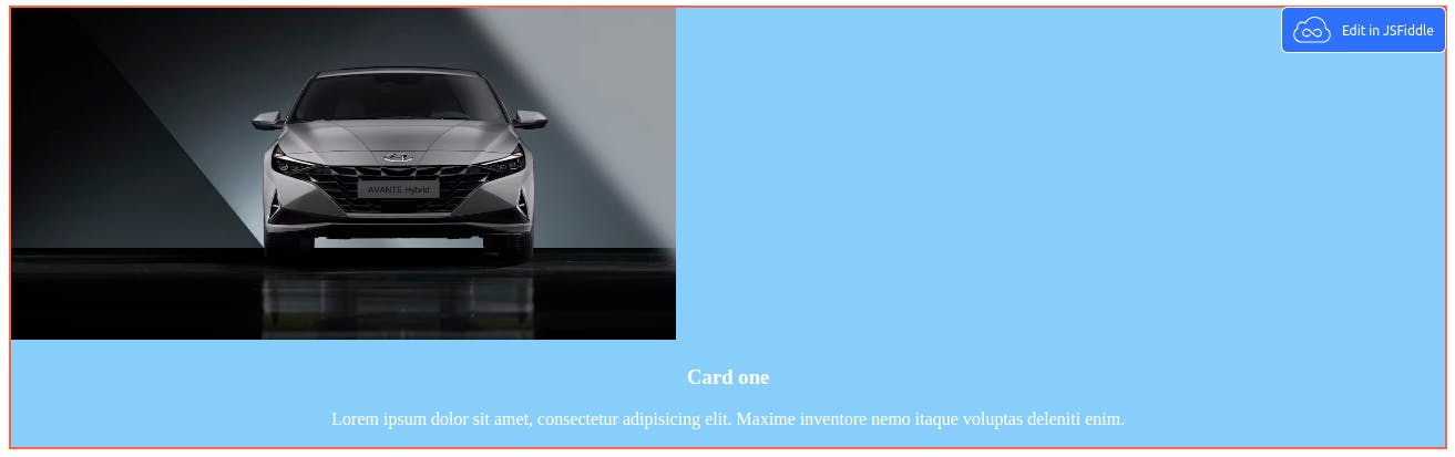
As we can see, the content takes up the full width, which does not look good.
Don't panic. We have a simple yet effective solution for this.
Auto-fill
With auto-fill, the grid will create as many columns or rows as it can fit within the available space. The grid items will maintain their size, and any extra space will be left empty.
To make the div uniform size irrespective of the number of cards, we can use the auto-fill property in such a way
.wrapper {
    display: grid;
    grid-template-columns: repeat(auto-fill, minmax(314px, 1fr));
}
But one thing to note is that we have to set the width manually here, i.e., minmax(width, 1fr), to fit the content according to the screen width.
Now, the div will always be 314 pixels, and if there are more divs, they will be managed accordingly and will be perfectly responsive.
Let's see how the UI will look in the below screenshot if two divs and a single div are rendered, respectively.


You can play with this fiddle link to understand it more deeply. Add a show tag to open this fiddle in a separate link.
Conclusion
A question might arise now: when should we use auto-fit and auto-fill?
If we know the exact amount of divs to be rendered, we can use auto-fit and if we don't, using auto-fill will be best.
So, this is the end of the article. Hope to get feedback if you know of a more admirable approach for handling responsive design.
Thank you for reading.